Microsoft Word script formatting
(Note, the techniques discussed in here are particularly apt for film, TV, radio, and theatre scripts, but they can also be applied to business documents)
Introduction
I'm in the middle of an English degree (applause). This year's module is Advanced Creative Writing. One of the things that seems to trouble people most is formatting their scripts using Microsoft Word. I can understand this, as these things can be somewhat confusing when you first start to use them. Surely, some people think, you just press the space bar a few times and that lines you up with the paragraph above? (Not a good idea, but I'll leave the why until later) Others are afraid of playing with the software in case the screw something up (you won't, honest).The truth is that once you understand how these things work and why they become second nature - a bit like learning to drive. So, it's a good idea to get used to them: your documentation will be so much nicer for you to produce, for others (and you) to read, and you're confidence will rise.
So, I thought, why not do an 'idiots' guide to formatting correctly with Microsoft Word. My hope is that it will be easy enough to follow that people who usually find these things intimidating will be able to conquer their fear and be able to hold their heads high whilst proclaiming themselves to be a Word Guru (okay, maybe not Guru, but perhaps a Power User).... I promise, I'll be gentle with you :)
First let's spend a moment understanding why good formatting is a good idea:
Good formatting is a good idea because when a document has formatting properly applied it will look the same regardless of where it is read.
Eh? What's he on about? The geezer is clearly mad! No, but I'm not, honest. You see fonts come in all sorts of shapes and sizes and lots of the characters you can't see are included in this hsape and size fest. For example, the humble space will take up a different amount of physcial space on your screen depending on which font you use and the size of that font. Let's not dwell on this now as you'll soon get the idea (if you don't, please post a comment here).
Hidden secrets
So, can we make formatting easier? Ah, well I'm glad you asked, because that's what I'm about to show you. To me, hidden secrets just aren't right so I think it's always best to be able to see all your formatting. Fortunately Word allows this (you see it, but it prints just wonderrfully). So, let's make sure we have the 'show all formatting' button pressed, and let's also show the ruler (not the Queen, but something like the ones you used to measure paper at school):
Next, we're going to set some options that help to make life just that little bit eaasier:


Okay, so by now you should hopefully have a good idea of where everything i.
Next, let's look at the application of formatting.
Different formats
Let's say we want to write a script. If this is a radio or drama script, you;d use the following notation:
NAME: Some speech
In film and TV, the notation is slightly different:
NAME
Some speech
You'll notice that the two look different. This is because in film and TV the character's name is above their speech, whilst in radio and theatre it is to the left. Also, both use different fonts: radio and theatre tend to use Arial or Times New Roman, whereas film and TV tend to use Courier New. I don't know how these conventions grew up, but there they are :)
The question is, how do you make it nice and easy to get the fonts you want and the spacing you need? Well, draw up a chair and let me show you :)
The examples here use film, simply because there's more to it so hopefully by showing you how to do it for film, you'll also be able to apply it to any of the other media (if I get a few comments wanting more on these I'll post something else up). Inccidentally, every technique here should work equally well for business documents and so on, it's just that you'll define your styles with some differences in font or indentation, but this should all become apparent as our journey progresses.
Let's say I have a character, conveniently called 'Toby', who is given the wonderfullly creative first line of 'Ah, Distaff. I'm glad you came round. I need to have a word about your stuffed penguin.' To render this properly we're going to set up two styles: one called 'Character' and the other 'Dialogue'. Character will be used every time the character's name appears; Dialogue whenever they speak.
Character will have certain properties, Dialogue will have others. Here is what we want for Character:
- The text needs to be centered on the page;
- The text is always in uppercase;
- The font is always Courrier New (because this is a film script).
Here's what my entirely fictious character and his speech look like before I do anything (clever or otherwise):

Remember the ribbon panels? We could ignore them and apply the necessary formatting without defining a style but then we'd need to go through the same several steps every time we wanted to repeat the character's name (or whatever). Setting a style allows us to do this very quickly because essentially what we're doing is creating a formatting template that Word is happy to apply everytime you tell it to. Actions speak louder than words, so let's just get on with it and see what happens (I'll explain the various aspects as we step through).
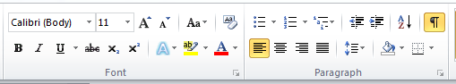
Okay, so back to the ribbon panel. We're going to use the 'Font' and 'Paragraph' panels to begin with. Here's what they look like:
Select the character's name. To do this, position the cursor to the left next to the text. It should form a pointy arrow that points towards the top right hand side of the screen. Click when it's next to the text and the text should be highlighted with a blue background, thus:

Leaving it highlighted (if you accidentally lose the highlight just repeat the step above), we're going to click on the centre text button, which is the one with the red circle round it:

When we click on that button, the yellow 'selected' background will switch to that button to tell you what you've done and, more importantly, the text will centre on the page. Here's what it should look like:

Those appalling red circles were added by yours truly, by the way (like you couldn't guess, right) ;-)So job sort of half done. But what we want is a fully done job. No half measures in this pub, thank you very much!
Our next task is to make the letters uppercase. It's true that we could just type them in uppercase but then what would happen if we got complacent or forgot or the lowercase Gremlin tried to take us over? Much better to make sure that we cannot do anything but uppercase, methinks. To do this, we need to expand the 'Font' panel. Do you remember the expand button at the bottom right of the panel? Here it is, with one of my perfect red circles round it:


To set the font, we simply scroll down the font list until we get to 'Courier New' (this is a standard font that should be on your list as it's one of the ones that comes with Microsoft Word on both the Mac and the PC). We're also going to set the font size to 12pt and make sure the text is uppercase. This picture explains how each step is attained:

- Scroll down until Courier New appears in the font list, then click on it;
- In the Size list, select '12';
- Select the 'All caps' tick box (under the Effects tab).


Let's move on to the character's speech. This involves very much the same routine, except that here we're going to play with margins and line spacing too. Don't worry, it's not nearly as scary as it sounds. The first thing is to select a line of speech. I'm going for the first line (spooky, eh?). As before, we're going to expand the Fonts dialogue box and change the font to Courier New and size 12. I haven't pictured this as it's the same as we did for 'Character' above, but this time without the 'All caps' box being checked. Here's my text:

Expand the 'Paragraph' panel. It looks like this before changes are applied:

Here's an explanation of what I've now done in the box:

- In the Alignment box, I made sure that 'Left' was selected from the drop-down list (it should be by default, but best to check);
- In the Indentation panel, I selected 9 pi for left, and 7.5 pi for right. Pi stands for Pica, by the way. Because we set picas as our default measurement unit earlier on, I can also just overtype the numbers without saying 'pi'
- I set the 'After:' value in the 'Spacing' pane to 12 pt. This gives me approximately 1 clear line after each paragraph of dialogue. I also set the 'Line spacing:' to 'Single'. This means that each line of text starts on the next logical line. If I had set it to 'Double' then there would be a blank line of text between each line in the paragraph. The difference between After: and Line spacing: is that the former refers to the space between paragraphs, the latter to space between lines in a paragraph.


Click 'OK'. The dialogue box closes and you are returned to the document. You should now see 'Dialogue' as a button in the Styles panel:


You can now step through your document clicking on text and applying Character and Dialogue formatting with relative ease.
However, before you do that, let me fix a small issuette - the space after the paragraph for Character is wrong. So, let's modify it (it should be zero). To do this, place your cursor in any line of Character formatted text. Now, go up to the Styles panel, and right click on 'Character'.


Click 'OK'. You'll be returned to the 'Modify Style' dialogue box. Just before we run off and celebrate, let's spend a moment relishing this box. You'll see that there is a box called 'Style for following paragraph:'. Hmm...

As dialogue always (well, nearly always) follows a character's name, wouldn't it be groovy if we could force one style to follow the other? Well, guess what! Yes, you got it... all we have to do is change the default value in this drop-down list to Dialogue and hey presto it shall be thus!

I can modify 'Dialogue' similarly so that when I hit enter the next paragraph defaults to 'Character'. Now, I can just write without worring about formatting every two minutes.
You can set up other styles too: Action, Scene heading, Parenthetical, and so on. Each can have its own 'Style for following paragraph', which can be any value you wish from the drop-down.
I may post some more tips for how to use Microsoft Word, including how to save these styles to a template, if people find this one useful.
I'd love to receive yoru comments if you found this useful.
Good luck!
Toby
PS: Check this post for gotchas to look out for when saving and submitting scripts.
No comments:
Post a Comment